First Air Unveils a New Look With Bold Colours and Arctic Symbol
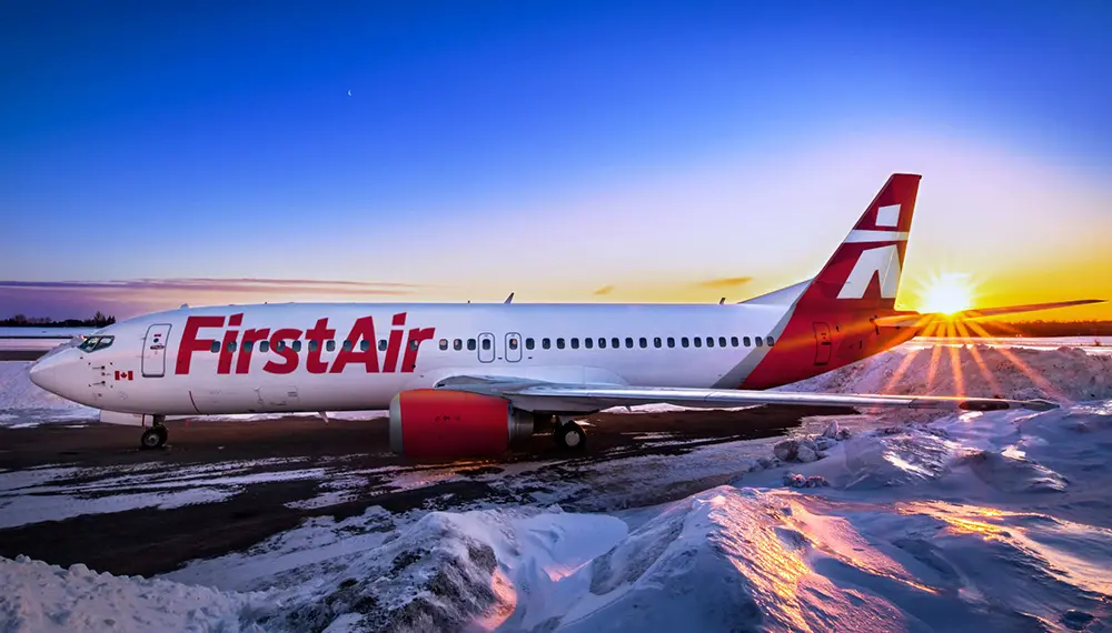
First Air has revealed a total makeover of its brand after 71 years as Canada’s preeminent northern airline.
Two aircraft in the new livery go into service immediately.
The new brand features a modern and unique version of the iconic Arctic symbol: The Inuksuk. This logo is representative of the people and land of the Arctic. In the words of one Inuit Elder consulted during the design process: “We never go anywhere without an Inuksuk showing the way.”
The airline’s new primary colours are red and grey.
Brock Friesen, President and CEO of First Air, said:
“We wanted colours that would showcase our stunning new logo, and that would stand out in the snowy Arctic and at busy southern airports. What better colour than Canadian red?”
In addition, the airline’s tagline is now: “Fly the Arctic”. To many around the world, Ottawa and Edmonton are the North. First Air’s operation has an Arctic responsibility attached to it, whether it’s transporting essential food, mail, or medical passengers, or uniting friends and families. There are no roads connecting the Arctic to southern Canada.
Friesen added: “We also want to inspire more tourists to visit this truly exotic destination. The Arctic is a place of wonder and increasingly, tourists from around the world are looking for out-of-the-ordinary travel experiences.”


![AIRBUS A380 [MORE THAN 600 PASSENGER’S CAPACITY PLANE]](https://cdn.tinn.ir/thumbnail/4jCp4EQvCU0b/IjHVrSYQrIAqIzXuTzADR7qLYX4idQT4nfq__26E5SCUPLMqfhWkWajvuO9Wfq1ql1TjV4dhkrHliNQU82kMpo2NNftT_NGEwHc9KXtN_rk731bmifa2IQ,,/airbus-a380-structure1.jpg)

Send Comment